ICC colour management is powerful but surrounded by persistent myths that lead to bad settings, wrong expectations, and disappointing in printing or displays. Paul Sherfield provides a concise overview of what ICC colour management does, and the most common myths and the realities behind them.

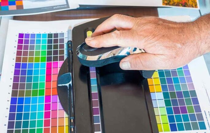
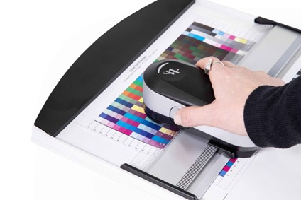
An ICC profile is a small data file that describes how a specific device, monitor, printer, scanner, camera etc, reproduces colour, and how to translate that device’s colours into a shared, device‑independent space called the Profile Connection Space (PCS). colour‑managed software uses these profiles plus a Colour Management Module (CMM) to convert between device spaces and the PCS so that colours look as consistent as possible across devices.
Because this process is mostly invisible, many users either expect “magic” accuracy from any ICC profile or distrust the entire system when it doesn’t behave as they expect. Most frustrations come from misunderstanding what profiles can and cannot do, improper profile use, or unmanaged devices and applications in the workflow.
Myth: What ICC profiles actually are for
- Myth 1: “A profile calibrates the device”
Reality: A profile describes a device’s current behaviour for; it does not change the device, only the way data is interpreted and converted. Calibration (e.g., changing monitor brightness or printer ink limits) comes first; profiling measures the calibrated state and stores it. - Myth 2: “There’s a secret colour references inside and ICC colour profile”
Reality: ICC uses standardised, device independent PCS spaces (based on CIE XYZ or CIE Lab) as the common reference, not a hidden vendor specific “golden” standard. Every device profile maps between that shared PCS and the device’s own colour space.[ - Myth 3: “ICC guarantees perfect colour accuracy”
Reality: ICC improves consistency and predictability, but is constrained by each device’s gamut, viewing conditions, and the quality of profiles and measurements. In many workflows especially printing, the aim is often a visually pleasing match, not strict numerical accuracy, for instance, RGB devises to CMYK outputs.
Myth: Gamut and RGB/CMYK misunderstandings
- Myth 4: “RGB always has a larger gamut than CMYK”
Reality: Many RGB working spaces, gamut’s, cover colours that no CMYK device can print, but some high-end printing conditions can produce colours outside small RGB spaces like sRGB. Gamut depends on the specific space or device, not just “RGB vs CMYK” as categories. - Myth 5: “Adobe RGB (or wide gamut) is always better than sRGB”
Reality: Wide gamut spaces can encode more saturated colours, but if the rest of the chain (monitor, web browser, deck-top printer, client devices) are not fully colour managed, images may look worse or duller than correctly tagged sRGB. For web and general use, sRGB often gives more predictable results because it aligns with typical low-cost monitor displays and many. web browser defaults. - Myth 6: “Converting to sRGB from wide RGB gamut’s always improves quality”
Reality: Conversion between spaces inevitably remaps or clips colours that are out of gamut, so you can lose unique colours during conversion. Starting with a wide gamut profile and then converting doesn’t “create” more colours; it just reassigns them within each profiles limits.
Myth: Assign vs convert and profile use
- Myth 7: “Assigning a profile is the same as converting”
Reality: Assigning a profile tells software to reinterpret existing numbers in a different colour space, while converting changes the numbers so the appearance stays (roughly) the same. Assigning the wrong profile to an image (for example, sRGB to Adobe RGB data) produces obviously distorted colours. - Myth 8: “You can fix any file by just assigning a ‘better’ profile”
Reality: If original colour information is missing or was encoded wrongly, assigning a different profile only reinterprets those flawed numbers; it cannot recreate lost or clipped colours. Proper capture settings and consistent colour‑managed processing are essential from the start. For a RGB image without a profile, the best option is to apply sRGB. - Myth 9: “Working‑space settings build or edit device profiles”
Reality: Choosing a working RGB or CMYK space in software affects editing behaviour, but it does not alter printer, monitor, or camera profiles themselves. Device profiles are created using profiling tools and measurements, independent of your working‑space choice.
Myth: Print, CMYK, and workflows
- Myth 10: “colour management is useless in CMYK only workflows”
Reality: ICC colour management remains beneficial even in CMYK only environments, because it still maps between different CMYK profiles for devices, standards, and conditions through the process. It helps predict how files will print on different presses or papers and simplifies proofing. - Myth 11: “One CMYK printer profile is enough for everything”
Reality: Printers need different profiles for different paper types, inks, and printing methods, because each combination will have a distinct gamut and tone response. Using the wrong profile for a given paper or quality setting undermines accuracy, even on the same printer. - Myth 12: “ICC makes screen and print match perfectly”
Reality: Screens emit light and prints reflect it, so they differ in contrast, brightness, and viewing conditions. Good profiling can bring them close, but exact visual matches in all conditions can be unrealistic, especially for very saturated or dark colours. I
If the screens colour gamut is smaller than say, Abode RGB or the Apple based P3 screens which in both cases offer a increase in 25% more colours then the sRGB screens.
Myth 13–15: Limits, software, and expectations
- Myth 13: “ICC profiles themselves do all the colour correction”
Reality: Profiles store measurement-based mappings and sometimes preferred rendering information; the actual conversion and gamut mapping are handled by the Colour Management Module, the CMM, in your software. Different CMMs e.g., Adobe’s vs system level CMM such as supplied by Apple, can yield slightly different results from the same profiles. - Myth 14: “If colours look wrong, ICC is broken and should be avoided”
Reality: Most “ICC problems” trace back to mis-profiled or un-profiled images, unmanaged screens, incorrect profile assignment, or poor calibrations rather than flaws in the ICC model itself. When every device is correctly profiled and applications honour those profiles, ICC workflows are stable and predictable. - Myth 15: “Once profiled, a device never needs attention again”
Reality: Monitors drift over time, printers change with new inks or papers, and ambient light varies, so profiles need periodic verification and recalibration. Treat profiles as snapshots of current behaviour, not permanent guarantees.
These myths persist because ICC colour management runs quietly in the background and involves several moving ‘parts’: calibrated devices, accurate profiles, consistent software settings, and realistic expectations about what can be matched or preserved.
Understanding that profiles describe rather than fix devices, that gamut and conversions have real limits, and that the whole chain must be managed will help you use ICC colour management effectively instead of fighting it.
Discover more content on Colour Management.