Achieving colour consistency is a major supply chain challenge. Varied lighting, substrates, and subjective interpretations often lead to costly rework. Successful manufacturers solve this by distributing uncut physical standards and master digital QTX files. Using feasibility data and standardised lighting ensures designers’ visions match final products, significantly reducing waste.
A swimsuit might start life as a sketch. By the time it reaches the shop floor, dozens of hands have touched it – designers, dye houses, printers, trim manufacturers, quality controllers. Each one interprets colour in their own way, under their own conditions, with their own tools. The result is often a product that looks nothing like the original vision.
This is the reality of colour management across complex supply chains. And for brands producing printed or dyed apparel, swimwear, or interior furnishings, it is one of the most costly, time-consuming challenges they face. Getting colour right is not just about aesthetics. It is about meeting the designer’s intent, matching the consumer’s expectation, and reducing the waste that comes from failed batches and rework.
Here is how leading manufacturers are solving it -and what every designer, printer, and manufacturer can learn from their approach.
The problem with colour across a supply chain
When a product is made from multiple components – fabric, trims, linings, printed panels -each component is often produced by a different supplier, in a different facility, sometimes on a different continent. Every one of those suppliers needs to hit the same colour target.
The challenge is that colour perception is not fixed. It changes depending on the light source, the substrate, and the precision of the tools being used to measure it. A colour that looks perfect under D65 artificial daylight might shift noticeably under cool white fluorescent or LED lighting. If two components of the same product behave differently under the same light, the problem becomes visible the moment a customer holds the item up in a changing room.
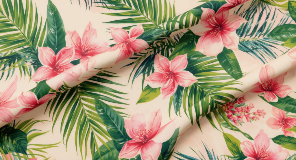
Mannequins wear vibrant one piece swimsuits with tropical floral patterns. Stylish beachwear collection displayed in a chic boutique. Summer fashion offers bright attractive, outfits for vacation.
This phenomenon – where two colours that appear to match under one light source diverge under another – is called metamerism. It is distinct from colour inconstancy, which refers to a single material changing its appearance across different light sources. Both are real problems. Both are preventable, if colour is managed correctly from the beginning.
Setting a standard that actually travels
The foundation of effective colour management is a shared, accurate colour standard – one that every supplier in the chain works from without modification.
Andrew Fraser, Director of Global Quality Control at InMocean, a vertically integrated swimwear manufacturer based in the United States, puts it plainly: “the detriment of all colour approval is cutting up colour standards. It sounds almost too simple, yet it is one of the most widespread failures in the industry.”
“I have seen in dye houses and print houses what they call a colour standard. It’s a quarter of the size of a US postage stamp,” Fraser explained during a recent colour management webinar hosted by Coloro. “The colour director will stand up with one of these little pieces and say, ‘Please, can I have a bigger colour standard?'”
InMocean’s response to this problem is deliberate. They purchase their own colour standards and distribute them uncut, in their original form to mills, printers, and trim manufacturers. The standard that leaves their facility is the standard that arrives at every supplier’s door. No guesswork. No interpretation.
But physical standards alone are not enough.
The digital standard: one master, one truth
Physical colour standards can fade, pick up contamination, or be misread by different spectrophotometers. Even instruments built on the same day can produce slightly different readings. This is why InMocean and many leading supply chains now use a digital spectral file, a QTX file as the definitive colour target rather than relying on each supplier to take their own reading of the physical standard.
“The standard is the standard is the standard,” Fraser noted, quoting advice he received early in his career. “Don’t change it. That goes for physical, and it goes for digital as well.”
John Newton, Head of Colour Technology at Coloro, reinforces this point. Coloro’s own team re-reads their standards multiple times to eliminate machine and human error before producing the master QTX file. They encourage supply chain partners to use that original file as the digital target – not to re-read it at the receiving end – so that every supplier is aiming at precisely the same point in colour space. The result is a tighter cluster of colour submissions across the supply chain, rather than a wide spread of interpretations all loosely orbiting the same target.
Clients using this approach are achieving a 70% right-first-time rate, compared to an industry average of 30%.
Checking feasibility before production begins
Even a perfect colour standard cannot fix a colour that was never achievable on a given substrate. This is where feasibility intelligence changes the game.
Not every colour can be reproduced consistently across cotton, polyester, nylon, or other materials. Some dye processes require expensive or difficult-to-source ingredients. Some colours are simply not stable enough under the required light sources. Discovering this during production – rather than before it – wastes time, money, and material.
InMocean learned this the hard way. A customer’s design team requested a specific turquoise blue on a secondary substrate. InMocean’s experience told them it could not be achieved. The customer disagreed. A study was commissioned, took over three months, and cost thousands of dollars. The conclusion matched what InMocean had predicted from the start.
“If you pick this colour which is very similar, we’re not going to have any issues, and we know that we can match it on the substrate you’re picking,” Fraser said. “It’s a great system- it gives us the ability to eliminate issues at the very beginning, not waste all that time to ultimately fail.”
Coloro’s Colour Feasibility Intelligence (CFI) platform is designed precisely for this purpose. It checks whether a primary colour match can be achieved across common substrates, whether that match holds across different light sources, and what the colour fastness will be once the recipe is established – all before a single sample is produced.
Light sources matter more than most people realise
Colour approval is often carried out under D65 artificial daylight, which is a spectrally complete, blue-white light designed for standardised evaluation. However, D65 does not reflect where most products are ultimately sold or used. Office environments, retail floors, and homes tend to use warmer lighting with missing wavelengths that subtly shift how colours appear.
Newton’s advice: designers should evaluate colours in a light box that simulates both D65 and the intended selling or living environment. If a colour shifts in a way that is unacceptable, a different colour should be selected – before the standard is distributed to suppliers. Once a stable standard is agreed upon, every supplier across the chain should match their output to that standard under the same defined light sources. When all the components come together: fabric, print, and trim they should behave consistently, because they have all been calibrated against the same reference point.
InMocean: a case study in vertical control
InMocean’s position as a fully vertical manufacturer gives them significant advantages in colour management. With design and production facilities that are company-owned and operated, they control more variables than most. Design teams in New York, California, and Columbus all work within the same colour system, using the same logical structure that allows a designer to navigate across hues, lightness, and saturation intuitively and consistently.
Their long-standing partnership with Coloro has given them a shared language for colour communication. The colour system’s seven-digit coding structure, which maps hue, lightness, and chroma to how the human eye perceives colour, means that creative decisions can be communicated with precision rather than approximation. When a designer selects a colour, that selection carries technical data that the supply chain can act on, not just a visual reference that depends on subjective interpretation.
What designers, printers, and manufacturers should take away
Colour management is a chain. Every weak link introduces variability, and variability drives waste. Here is what each stakeholder can do to strengthen their part of it:
Designers should select colours in controlled lighting environments and check how they behave across multiple light sources before signing off on a palette. Use feasibility data early. If a colour cannot be achieved on the required substrate, or if it will shift unacceptably under retail lighting, knowing this at the design stage saves months of rework downstream.
Printers and dye houses should insist on receiving full-size, uncut physical standards and the master digital QTX file. Do not re-read the physical standard to generate your own target, use the original digital file. Ensure your spectrophotometers are calibrated and that your spectral tolerances are defined and agreed upon before production begins.
Manufacturers and supply chain managers should take ownership of the colour standard distribution process. Purchase enough standards to supply every supplier in the chain and make clear that cutting them is not acceptable. Define the light sources under which all approvals will be evaluated and communicate these to every participant in the workflow.
The business case for getting colour right
Colour consistency is not just a quality metric. It is a commercial standard. Failed batches, late deliveries, and rejected samples all carry real costs in materials, time, and supplier relationships. Brands that establish a rigorous, data-backed colour process gain a measurable competitive advantage: faster development cycles, fewer surprises at production, and products that reach the market looking exactly as intended.
The standard is the standard is the standard. Make it a good one, share it completely, and protect it at every step.
Discover Textile 2026 and register now. Visitors can purchase super early bird tickets for €30 until 23 March by using the code FESG601.
Discover Textile 2026
Textile 2026, launching alongside FESPA Global Print Expo in Barcelona (19–22 May 2026), is where function, print, and production converge to shape the future of textiles. Visitors can purchase super early bird tickets for €30 until 23 March by using the code FESG601.