Every year, new color trends are announced. This has a greater impact on the work of digital printing companies than it might seem at first glance. What should service providers be preparing for in the coming years?
Color trends don’t just happen by chance. They are the result of social, technological, and cultural developments. Trend research firms such as WGSN and the German Zukunftsinstitut analyze global developments in fashion, technology, and consumer behavior years in advance. Companies like Pantone translate these into color palettes that are adopted by the industry.
As a result, their influence is significantly stronger and takes hold much earlier than the “trend colors” that fashion publications regularly highlight. This is because those publications only consider products that are already available in stores—and thus reflect the current state of affairs.
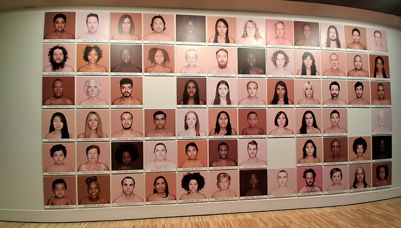
Trend colors and “Colors of the Year” are directly relevant to the printing industry. This is because they shape brands’ visual communication. Whenever these colors are used in print communications, POS displays, or packaging materials, printing companies must reproduce these shades with pinpoint accuracy.
In digital printing, color trends have a direct impact on production processes. While in offset and screen printing, trendy shades are introduced to the market as spot colors, digital printing is primarily based on fixed color sets of four to 12 process colors. Reproducing trend colors therefore always places increasing demands on color space, color management, and workflow.
Color Trends for 2026
The color trends for 2026 can be divided into several categories, each drawing from different sources.
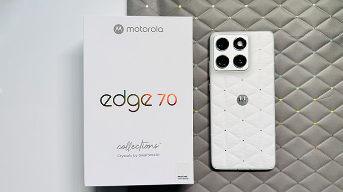
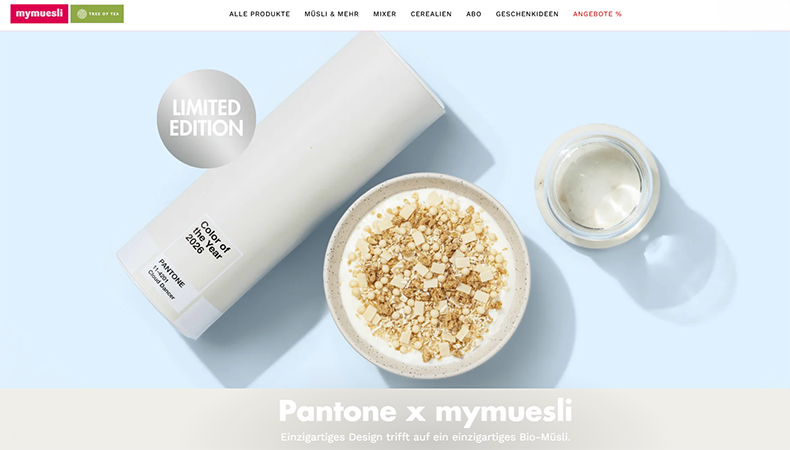
Pantone is sending a key message with “Cloud Dancer” (Pantone 11 4201). This is a very light, off-white shade that is interpreted as a symbol of calm, clarity, and new beginnings.
This unusual choice—the first time a shade of white has been named “Color of the Year”—reflects a desire for minimalism, simplicity, and “quiet luxury.”
In practice, this shade is used in fashion collections, interior design, and minimalist packaging designs, such as the limited-edition MyMuesli “Coconut Dream” product.
Pantone has not yet announced its choice for 2027 to the general public. WGSN and Coloro, on the other hand, proposed “Luminous Blue”—a very intense shade of blue—as the key color for 2027 as early as 2025.
In addition, interior and packaging trends show strong demand for earthy colors such as terracotta, ochre, and cocoa, as well as neutral tones such as greige, sand, and warm white.
In packaging design, muted colors such as pastel green, orange, or purple are used strategically to convey sustainability, emotional appeal, or trust.
Overall, current designs tend to be clean and feature large, open spaces, in keeping with the “Scandi style,” which has been very popular for years. A new trend is accents in bold, vibrant colors. The pattern trend of the early 2010s is largely “out” for now.
Technical Challenges Posed by Color Trends
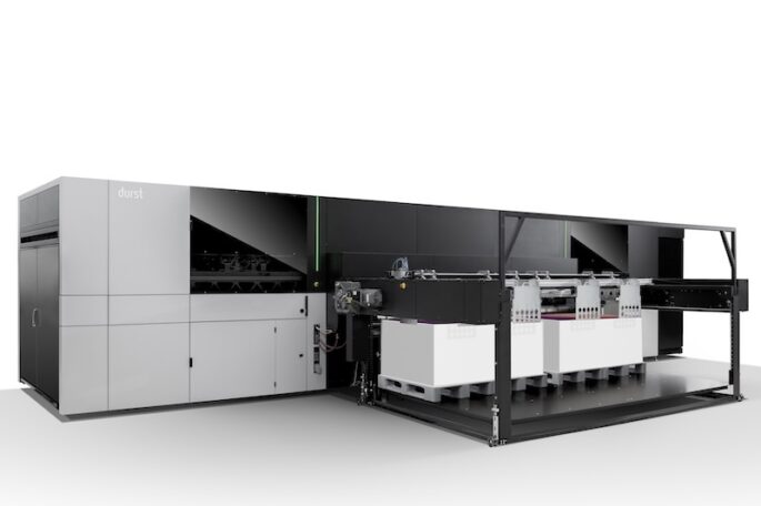
The trend toward very light colors such as “Cloud Dancer” poses significant challenges for digital printing. After all, printing is typically done on a white background, so the ink coverage for such shades must remain very low. Ink sets with many light shades can be advantageous here. They are often found in digital printing presses designed for photos or fine art printing.
To make matters worse, on large university campuses, even the slightest variation in light and pastel colors is very clearly visible. Disturbing patterns (moiré) and banding stand out much more quickly than in intricate designs or patterns.
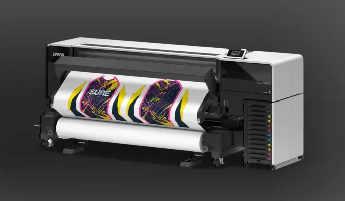
Even very bright colors are difficult to reproduce in four-color printing. That is why digital printer manufacturers have expanded their color sets over the years. In addition to cyan, magenta, yellow, and black inks, red, green, orange, purple, and blue have been added. This has greatly expanded the reproducible color gamut. Manufacturers such as Canon, Epson, and Swissqprint also offer special neon inks for fluorescent accents.
The HP Indigo ElectroInks technology also includes neon shades, as well as silver for metallic effects. In addition, there is an off-press color mixing system that can cover up to 97% of the Pantone palette.
Mastering Color Trends: Technologies and Workflows for Print Shops
To keep pace with changing color and design trends, digital printing companies need tailored technologies and processes.
While Pantone’s 2026 trend color, “Cloud Dancer,” does pose a particular challenge, for many brand owners, print products are no longer at the center of the design process. As a result, we can expect to see colors and designs in the future that are difficult to reproduce perfectly on paper and film.
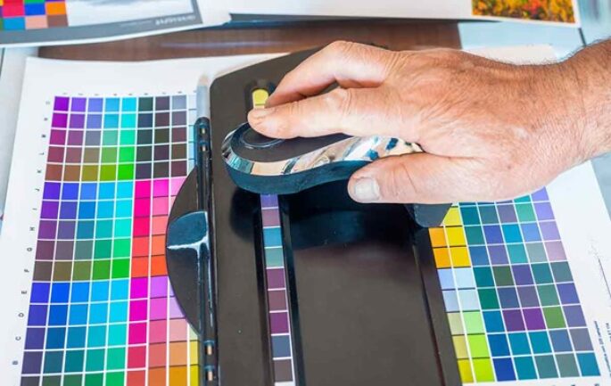
Consistent, highly automated color management using ICC profiles and proofing processes—which enables the reproduction of even the most challenging colors—is therefore more essential than ever for digital print shops.
In the future, traditional offset color spaces will play an increasingly minor role. By contrast, the much wider color gamut that can be achieved with digital printers and seven or more process colors is gaining in importance.
But that drives up costs, because prepress, coordination processes, and quality control become more complicated. In addition, the ongoing maintenance costs of a digital printer increase with every additional ink cartridge.
Color Trends: Opportunities and Challenges for Digital Printers
Color trends vary by industry: Different rules apply to textiles and interior decoration than to packaging or point-of-sale displays. As a result, not every printing service provider is affected by them to the same extent.
However, longer-term trends—such as Scandi Design, with its large, calm swaths of color—are certainly influencing the entire printing industry. Compared to intricate designs with many patterns, less printing capacity is required.
At the same time, the remaining jobs are more technically and organizationally demanding. This calls for even closer collaboration between design and production. Printing companies should expand their consulting expertise and ensure, as early as the design phase, that colors and designs can actually be reproduced in print.
As a result, color trends and design trends are driving forces that are reshaping the printing industry’s production strategies over the long term. That’s why it’s worth it for print shops to keep a close eye on these trends regularly so they aren’t caught off guard by complex challenges like “Pantone Cloud Dancer.”
Discover more content on color management