Managing colour in a wide format workflow
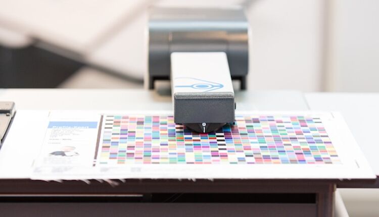
The wide format printing industry was quick to adopt colour management as a way of coming to grips with the wide variety of printers, inks, media, RIPs, and settings.
One of the main objectives for colour management is to get the most out of the printing device used to print the job. For a designer or project manager this can be a challenge because, in the early stages of design, it’s quite common that neither the printing press nor the substrate to be used are known.
This means that the artwork must be created so that the colour separations and final colour adjustments can be made once the printing device, ink and substrate are known and at the very last minute.
This is important because it gives you the flexibility to make choices that suit your project. If you perform colour separations for images and other elements in the artwork very early on, you may be using an ICC profile that has a limited colour gamut and you can’t easily change your mind later.
Once the colours have been converted to one flavour of CMYK, the maximum gamut is limited to that range of CMYK colours. Even if it’s technically possible to convert from one CMYK gamut to another, the number of tone values and the gradation of the images has been compressed in the first conversion, and this can never be fully reconstructed.
We suggest keeping your photos in a large gamut, typically RGB, at the design stage. Adobe RGB is a well-defined colour space and slightly larger than what most printing devices can reproduce, so it is very suitable. Use this as the default colour gamut for photos.
There is another popular RGB colour space, sRGB, but this is much smaller than Adobe RGB, and smaller than the gamut of what many high-end printing devices can reproduce. So, while popular in consumer applications, we wouldn’t recommend using sRGB in high-quality print workflows, especially for wide format digital printing where colour gamuts can be very high.
Linework and other design elements, especially brand colours and logos, can be addressed as special colours, called spot colours, in the design stage even if they may end up being printed as CMYK only. The principle here is to only convert spot colours to CMYK when, and if, necessary. In this way, the colour accuracy for brand colours will be as accurate as possible for the specific combination of printing device, ink and substrate used.
Many of the latest large format printing devices offer a larger colour gamut than conventional printing methods (like screen, flexo and litho offset), so it would be a bit of a shame to reduce your colour gamut for your digital prints early on by converting your artwork for conventional analogue print unintentionally.
Preview the colours using an accurate softproof

Contrary to what many may think it’s actually possible to preview the printed colours accurately, including many of the spot colours. But you need a calibrated high end monitor for this, like for example this SpectraView Reference monitor from NEC.
The best way to preview the colour accuracy of a specific piece of artwork is, of course to ask for a colour-managed hardcopy proof, either using the actual printer and substrate which will be used for the final production, or a high end digital printer calibrated and set up for production of accurate contract proofs.
But, to save time, you can preview your artwork colour-accurately on the monitor as long as you have access to a monitor suitable for high-end softproofing. Those types of monitors used to be very, very expensive, perhaps five times the cost of normal office monitors.
But today you can get a very good monitor from a selection of specialist vendors like BenQ, Eizo and NEC, at reasonable prices. The price for such a high-end monitor typically includes calibration software and a colorimeter, as well as a hood to protect the screen from disturbing ambient light and reflections.
Once the monitor is calibrated to match Adobe RGB, for example, you can ask your design and retouch software to simulate what the colours will look like in print by applying the ICC profile for that printer and ink/substrate combination.
Your print service provider will know what this is, or should know if they are as colour savvy as one would expect, and can supply it. The small additional cost for a proper softproofing monitor will soon pay for itself, since it provides a colour-accurate preview of your artwork and will help you avoid costly and annoying reprints in the future.
Applied colour management saves time and reduces waste

If you must convert spot colours to CMYK, don’t do it until the very last moment. The illustration shows the colour space of single spot colours compared to that of conventional offset, and many spot colours are outside the gamut of CMYK.
Saving your original artwork, images and logos in a large gamut colour space gives you flexibility. You can optimise your work at the last possible moment to get the most out of the print process used, even if you change the substrate, ink or printer at a very late stage. This is called working in a ‘device-independent colour space’ while the production intent is yet to be defined.
The colour conversion shouldn’t happen until both the actual printing process, including which inks and substrate will be used, has been decided. A practical way to handle this is to do the colour conversions when exporting the artwork to a high-resolution PDF.
Just make sure that the spot colours are preserved as pure spot colours and not converted to CMYK, if you know that the prints will be produced using real spot colours. If in doubt, ask the prepress department at the print firm how to do it. However, they may prefer to get the native files from you in order to make those last-minute adjustments to the artwork themselves.
There are some other adjustments regarding, for example, trapping, overprint and impositions that might be safer to hand over to an experienced prepress operator. But following our suggested guidelines you have at least prepared your artwork as best you can to allow for the job to be printed in an optimised and successful way.
While colour management for digital print production can’t be said to be an easy task, it’s not black magic nor is it impossible to understand. Properly applied colour management will give you peace of mind that the colours you see on your calibrated high-end monitor are what you can expect in print, so you will save time, avoid unnecessary trial-and-error activities, and reduce wasted time and materials.
Topics
Interested in joining our community?
Enquire today about joining your local FESPA Association or FESPA Direct
Recent news

Industry Experts Explore the Evolution of Smart Manufacturing in the Textile Industry
A FESPA SmartHUB roundtable at Personalisation Experience 2025 discussed smart manufacturing's transformative impact on the textile industry. Experts highlighted the shift to on-demand customisation, driven by digital printing, data analytics, and automation. Key takeaways included enhanced machine control, significant waste reduction through intelligent software and colour management, and improved sustainability via energy efficiency and near-shoring, ensuring agility and environmental responsibility in textile production.
FESPA 2025 gathers leading visionaries from across the speciality print industry in Berlin
FESPA Global Print Expo 2025, European Sign Expo and Personalisation Experience (6 – 9 May 2025, Messe Berlin, Germany) welcomed Visionaries from across the speciality print industry to shape the future of print, develop forward-thinking business strategies, and explore innovative ways to translate emerging industry trends into tangible growth opportunities.

Exploring Cutting-Edge Textile Printing Innovation with Adobe Print Engine 7
Adobe PDF Print Engine 7, launched at FESPA Global Print 2025, significantly advances textile printing. Debbie McKeegan shares how it automates non-white substrate management and RGB colour handling, expands colour gamuts with in-RIP multicolour transparency blending, and streamlines workflows for efficiency and sustainability. This update boosts customisation, reduces waste, and positions businesses at the forefront of digital print innovation.

FESPA Global Print Expo 2025 - Overall Highlights
FESPA Global Print Expo, Europe's leading print and signage exhibition returned to Messe Berlin from 6 - 9 May 2025.