What is the colour of the year 2016?
When is a colour something more? One of the leading authorities on colour, Pantone, has announced their 'Colour of the Year 2016'.
A softer take on colour for 2016. For the first time, the blending of two shades, Rose Quartz and Serenity are chosen as the Pantone Colour of the Year.
As consumers seek mindfulness and well-being as an antidote to modern day stresses, welcoming colours that psychologically fulfill our yearning for reassurance and security are becoming more prominent.
Joined together, Rose Quartz and Serenity demonstrate an inherent balance between a warmer embracing rose tone and the cooler tranquil blue, reflecting connection and wellness as well as a soothing sense of order and peace.
The prevalent combination of Rose Quartz and Serenity also challenges traditional perceptions of colour association. In many parts of the world we are experiencing a gender blur as it relates to fashion, which has in turn impacted colour trends throughout all other areas of design.
This more unilateral approach to colour is coinciding with societal movements toward gender equality and fluidity, the consumer's increased comfort with using colour as a form of expression, a generation that has less concern about being typecast or judged and an open exchange of digital information that has opened our eyes to different approaches to colour usage.
Rose Quartz & Serenity colour pairing
Rose Quartz is a persuasive yet gentle tone that conveys compassion and a sense of composure. Serenity is weightless and airy, like the expanse of the blue sky above us, bringing feelings of respite and relaxation even in turbulent times.
Whether in soft or hard surface material, the pairing of Rose Quartz and Serenity brings calm and relaxation. Appealing in all finishes, matte, metallic and glossy, the engaging combo joins easily with other mid-tones including greens and purples, rich browns, and all shades of yellow and pink. Add in silver or hot brights for more splash and sparkle.
Background
For 15 years, Pantone’s Color of the Year claims to have influenced product development and purchasing decisions in multiple industries, including fashion, home and industrial design, as well as product packaging and graphic design. Past colours include:
PANTONE 17-5641 Emerald (2013)
PANTONE 17-1463 Tangerine Tango (2012)
PANTONE 18-2120 Honeysuckle (2011)
PANTONE 15-5519 Turquoise (2010)
PANTONE 14-0848 Mimosa (2009)
PANTONE 18-3943 Blue Iris (2008)
PANTONE 19-1557 Chili Pepper (2007)
PANTONE 13-1106 Sand Dollar (2006)
PANTONE 15-5217 Blue Turquoise (2005)
PANTONE 17-1456 Tigerlily (2004)
PANTONE 14-4811 Aqua Sky (2003)
PANTONE 19-1664 True Red (2002)
PANTONE 17-2031 Fuchsia Rose (2001)
PANTONE 15-4020 Cerulean (2000)
Topics
Interested in joining our community?
Enquire today about joining your local FESPA Association or FESPA Direct
Recent news

Streamlining personalisation with tech: Insights from the SmartHub Conference 2025 speakers
Personalisation Experience 2025 (6 – 9 May 2025, Messe Berlin, Germany) is running its inaugural SmartHub Conference from 6 – 8 May 2025.

Special Effects in DTF: How Neon Inks Are Making Apparel Pop
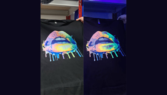
Neon fluorescent inks are the latest innovation in DTF printing, offering vibrant, eye-catching effects under both daylight and UV light, giving apparel decorators a competitive edge. Testing shows good wash durability, though market perception of added value is still developing. With increasing adoption and ongoing technological advancements, neon represents a significant upgrade for creative customisation.

Unlocking Growth Opportunities in the Printed Personalised Apparel Industry
The printed personalised apparel industry is booming, projected to reach $10.1 billion by 2030. Driven by consumer desire for self-expression and branding needs, technological advancements like DTG/DTF and e-commerce integration are key. Sustainability, eco-friendly materials, and on-demand printing are crucial growth drivers. Businesses leveraging these trends, including AI and social media, have significant commercial potential.

How to grow your business with white ink applications
Opaque white ink is revolutionising signage, vehicle graphics, wallcoverings, short-run and wood packaging, and window blinds by enhancing vibrancy and clarity. This enables printers to offer high-demand, standout products, boosting profit margins. HP Latex white ink applications and their large format printing solutions will be showcased at FESPA 2025 in Berlin.