Paul Lindström discusses the basics of image enhancement and more advanced possibilities including Camera RAW and High Dynamic Range (HDR) photography.
There was a time when all images prepared for print were checked and often thoroughly retouched and optimised by imaging professionals. Not so anymore: many images are used more or less straight out of the digital camera, without much work done on them. This is mostly fine, but there are still some general aspects of digital imaging that still hold so even more advanced image processing might be worth the effort. Let’s go through some of the basics and then touch briefly on some more advanced possibilities.
While modern digital SLR cameras, and even top of the range mobile phones, create very good photos without much need for manual editing, there are some core aspects of what makes a photo look really good, technically. The following list isn’t necessarily in order of what is most important, because that is somewhat subjective. It often depends on what kind of motif is in the picture, and what kind of usage the image will have. But one of the first aspects in sharpness, if the resolution is high enough. Next is contrast that is, are the white areas actually white or are they greyish? And are the deep blacks really as black as they should be? If not, the image will look flat and dull.
Then there is the grey balance, which is where not all cameras manage to process the raw image, what the sensor captured, in an optimum way. If the grey balance is wrong, all other colours look slightly wrong as well. Finally we have the question of colour accuracy. Are key colours true to what we know them to be in real life? If not, there are some actions we can take to fix the problem, either manually or by applying colour management to the best of our knowledge. We’ll go through those four steps one by one and see what can be done in different software to help us improve our images and optimise them for final print.
Sharpness
How sharp an image appears depends on a number of factors. One is the resolution at which the image was captured, but also the quality of the lens, and if the shot was taken without movement of the camera. We won’t have room for a full photography lesson here, describing how to take the perfect photo, but instead let’s assume we need to do what we can to try and sharpen up a photo that isn’t perfect. Of course we have made sure we have access to the original image, and we can make use of all the image data available. The rule of thumb still applies: a photo should be at twice the resolution in Pixels Per Inch ( PPI) than the resolution used in print, Lines Per Inch (LPI). That’s where the commonly suggested image resolution of 300 ppi, comes from, since a 150 lpi screen resolution was more or less default in offset printing for many years. While the output screen types and resolutions are different in digital printing than with analogue printing methods, an image resolution of 300 ppi is still a good general suggestion. If the image is to be viewed at distance, you might settle for a lower image resolution, to avoid unnecessarily large file sizes.

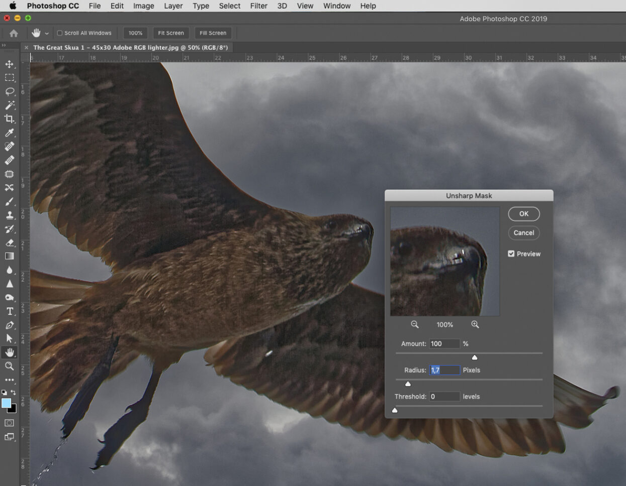
Caption: While there are limits to what you can do to sharpen an image, the Unsharp Mask tool in for example Adobe Photoshop can sometimes enhance an image considerably. Using another tool you can apply extra sharpness to selected areas of the image.
The most common trick to help an image to look sharper is by applying an unsharp mask in, for example, Photoshop. The word may seem strange, but it comes from the old manual way to do this in a repro camera when creating colour separations of the image. A copy was made of the image using a diffusing film to blur the copy slightly. This copy was then inverted and placed on top of the original image. A contour appeared at the edges of objects in the image, which was copied onto the final image of the black separation. This thin contour created a visual effect to make the image look sharper. Use this function in software with some moderation and care, because if you try and sharpen the image too much it will look strange, and the contours around objects will stand out in a disturbing way.
One trick is to only sharpen selected areas of the image, like the eyes of a person, or single objects in an image such as a piece of jewellery. And leave the rest of the image as it is, even if it’s not as sharp as you might have preferred.
Contrast
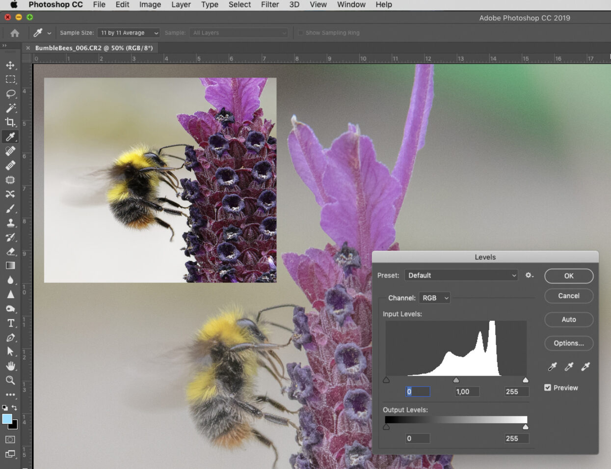
The most common way to check that there is enough contrast in an image is to open the histogram image analysis function (in Photoshop it’s called Levels). Here you can see if what should be near white or near black are at the end points of the tone curve. If not, adjust the curve so that pixels that are white in reality get that pixel value, (near RGB 255, 255, 255), while deep blacks should be near RGB 0, 0, 0. Now the image should look much better, and an image that looked flat and dull before, will suddenly come to life.

Caption: Some images look flat and dull, and this might be because the white- and black points are not correctly set. By checking the tone levels and adjusting them if necessary, the contrast is restored, and the image comes to life (see the Bumble bee in the box in the top left corner after Levels have been adjusted!
Grey balance
While all cameras try and adjust both white point and grey balance to be correct, some images come out looking not just right. It could be that the light condition when the photo was taken introduced a colour cast, for example bluish if the photo was taken outdoors and the picture is dominated by shadow areas. Or if the photo is taken with artificial light, and the light source introduced a greenish or yellowish colour cast. If you have access to the raw image file for this photo you can adjust the white point in, for example, Adobe Lightroom, or some other Camera RAW image processor, such as DxO PhotoLab. When you modify the white point, the overall grey balance will also be affected. If this isn’t enough, you can modify the grey balance further. In Photoshop this can be done with the Levels function, in the same window as was mentioned earlier (find it in the Image/Adjustments/Levels menu).
Colour accuracy
In many cases you want key colours in the image to be as accurate as possible, so grass should look green, a blue sky should look blue, chocolate should look yummy brown etc. If not, you can either make selective colour changes manually, or try and calibrate your camera to produce more colour accurate images in the first place.
To modify single colours you can try the Selective Color tool in Photoshop, where you start from the base colours Red, Green, Blue, Cyan, Magenta, Yellow as well as being able to modify the white, neutral (grey) and black areas. If you don’t get the result you hope for with this tool, you can try the Replace Color tool and pick the areas in the image which need to be modified.
If you have control over the light used in the image, for example if take you photos in a studio, you can calibrate your camera and make a customized ICC profile for that light environment. In this way you will get more colour accurate images directly out of the camera, with less need for manual adjustments. But this only works for photos taken in the same light setting, and is only worth doing if you create a lot of images in the same session. A custom made ICC profile for a digital camera only applies for that very lighting setup, not for photos taken in different light conditions.
More advanced image enhancements
The above deals with images that have already been taken, and where you try and make the most of them, after the fact. We will now suggest some techniques for getting higher quality images, if you can influence how the photos are taken in the first place.

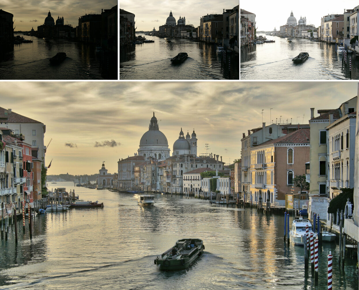
Caption: One way to expand the tonal dynamic range is to combine several exposures into one. This is called High Dynamic Range (HDR)imaging. Here three different exposures are combined into one final image. One exposure is with normal settings in the camera, the other two are under- and overexposed. With a very large dynamic range you can capture details in both shadow areas as well as in the highlight areas.
We mentioned Camera RAW before, and professional photographers normally use this to get the most out of their cameras. But as the name indicates, this image file format doesn’t process the images, but saves the captured image data unprocessed, a bit like with old colour negatives. The image data has a 16-bit tonal depth, which means you can play with over 65,000 levels of grey when you process or edit the image. If an image is saved as sRGB or Adobe RGB, it’s normally in 8 bit, so it only has 256 levels of grey per RGB channel. This reduces the scope for changes in the image without loosing colour data in the process. So use Camera RAW if you can, or suggest the photographer to do so for the images you order, and you will have more room and possibilities for final adjustments later on.
Another way to achieve stunning images is to use the High Dynamic Range (HDR) technique. This means taking multiple exposures of the same scene, and then combining them into one final image. While a photo taken with one exposure has the dynamic range of perhaps 12-14 f-stops (where you can see details in both shadow areas and the highlight areas), using HDR you can increase this range to be perhaps 24 f-stops or more. With three exposures you take one shot with normal, optimum exposure, typically based on the tone values of the mid-tones, and then one over-exposed image and finally one under-exposed image. Photoshop has a basic function to merge such images into the final HDR version, but there are other dedicated softwares for this, such as Aurora HDR from Skylum Software.
Make the most out of your images before you send them to be printed. Quickly go through the four basic steps mentioned above, and if you want to go further experiment with different RAW image processors and HDR photography.
The Wild Format guides are intended to expand awareness and understanding of the craziness that can be created on wide format digital printing devices, from floors to lampshades and everything in between. These guides are made possible by a group of manufacturers working together with Digital Dots. This article is supported by HP and Digital Dots.