Large format digital printing offers solutions to print on almost any type of material, there are challenges regarding managing colour appearance. Paul Lindström discusses the limitations for some substrates and ink combinations should help you reach a satisfactory end result.
Interior decorations is one of the most rapidly expanding business areas for digital printing, since a designer or vendor can produce bespoke products in very short runs, without the penalties that come with traditional printing, such as high initial start up costs. Digital printing has overcome most of the early problems regarding quality, and today can actually offer superior quality, for instance when reproducing photographic images, compared to conventional screen printing. But with all printing methods, every type of substrate, be it textiles, wood, metal, glass, plastic or paper, needs the right type of ink. With digital printing the ink determines which type of digital printer to use. And to achieve a very wide range of colours, standard CMYK process colours might not suffice.
Photographic images and vector graphics
There are two main categories of graphics, but they can both be colour managed. Logos, patterns and line art illustrations are typically created and saved as vector graphics, and as such can be enlarged or scaled in size freely, without loss of quality. Vector graphics are usually monochromatic and often coloured using spot colours, like for example one of the Pantone colours. This is the first challenge in colour management for digital wide format production: how to best convert those spot colours to a matching mix of the CMYK process colours. While many types of interior decorations, like wallpapers, traditionally use patterns made up of a number of elements, each using a certain spot colour when printing in conventional screen, this may not be possible in digital printing. As a designer you need to be aware that the CMYK colour gamut only matches about 65-70% of the spot colours, depending on substrate and type of ink. If you are used to working with spot colours and need to convert existing designs to process colours, you might have to accept that some of those spot colours can’t be matched a 100% accurately just with CMYK.
Checking for an accurate match
The way you can check if the CMYK version of the colours will match the spot colour, is to measure the colours with a spectrophotometer. The unit for colour difference is called ∆E (Delta E) and ideally a reproduced colour shouldn’t deviate more than let’s say 2.5 ∆E, or we will notice a slight difference in hue. Most people will probably say that when the colour difference exceeds ∆5 it’s not the correct colour anymore. But this all depends on if the person has better than average colour vision, more about this later.

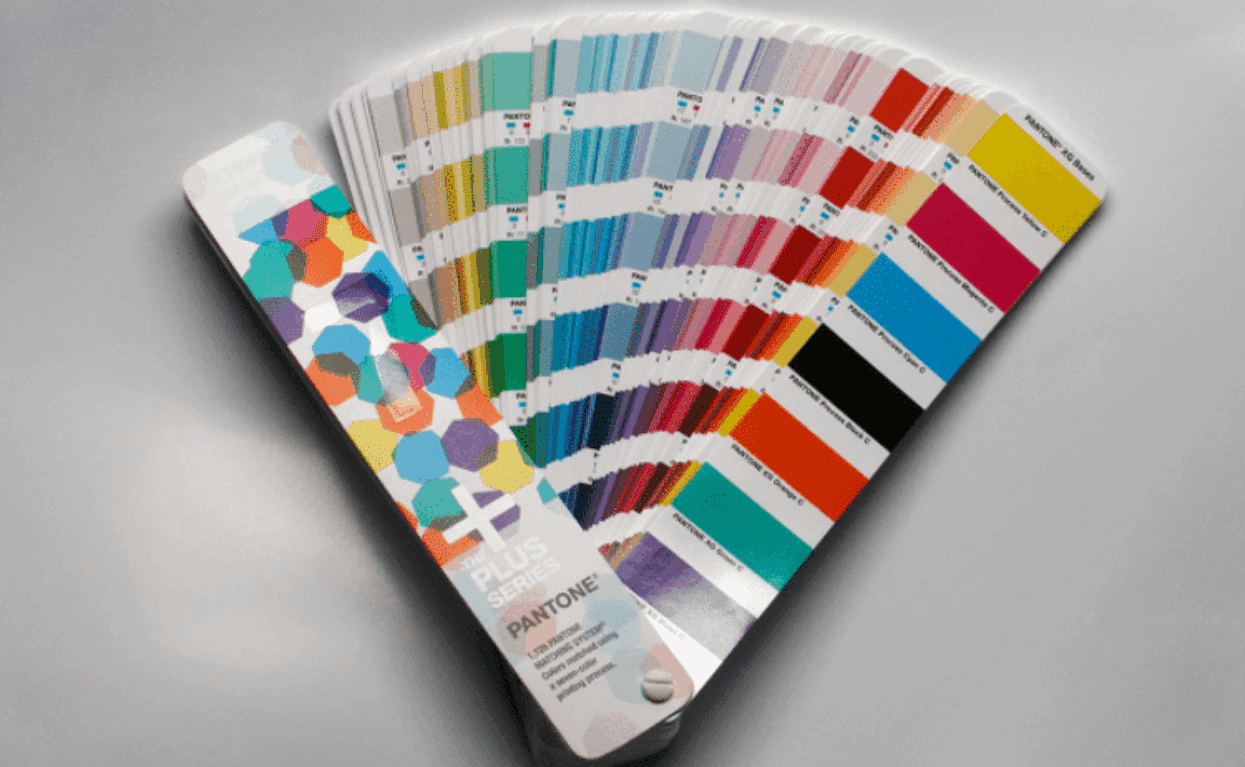
Caption: Many, but not all of the spot colours, can be accurately reproduced with the CMYK process colours. If you need to reproduce all of the spot colours accurately in digital large format printing, you’ll have to check with your print service provider. They must have a printer with the extended colour gamut ink setup, with the additional colours Orange, Green and Violet, as in this colour sample from Pantone.
If you are about to produce interior decorations that must match a certain spot colour, or series of spot colours, you need to check with the print service provider if their digital printers can use an extended ink setup. This typically adds orange, green and violet to the base CMYK process colours. Now the digital printer suddenly can reproduce close to 99% of the special spot colours, again depending on what substrate you use.
RGB to CMYK conversions
When reproducing photographic elements the challenge in colour management is not directly related to spot colours as such, but rather how accurately photos are converted from RGB to the CMYK process colours. The primary colours in the additive colour gamut are Red, Green and Blue, and those colours are achieved in print using a mix of Cyan, Magenta and Yellow (the black ink is called K as in Key colour, and doesn’t affect the hue, only the dynamic range of the shadow areas). The CMYK colour system is subtractive, so Red, Green and Blue colours are the secondary colours achieved when two or more of the primary colours are mixed. These secondary colours are less saturated than the primary colours, and red, orange, green, blue and violet etc are difficult, sometimes impossible, to match in CMYK. If part of your wild format artwork is photos where green, orange and violet hues are essential for the design, you should use a print service provider with digital presses capable of extending the ink set beyond CMYK to include at least Orange Green and Violet. This is called the extended colour gamut and is fast being embraced by more and more manufacturers and added to some of their digital printer models.
One of the advantages of digital printing versus conventional printing is that sample prints can be made in the same device as will be used for final production. As long as your print service provider uses relevant prepress software and raster image processors to handle the required colour management, you should be able to specify which parts of your designs need to match named spot colours. Make sure the proofs (sample prints) are made in the same device as will be used for actual production and check the proofs carefully. Among the workflow solutions on the market, and hugely popular for large format production, is the EFI Fiery RIP, and it has excellent functionality for handling spot colours.
Test your colour vision!
When we said that most people will say that a colour deviation of more than ∆E5 is unacceptable, it actually depends on how good your colour vision is. If you do a lot of critical colour evaluations you should check it because only about 10% of both men and women have perfect colour vision, or superior colour discrimination capacity as it is called.
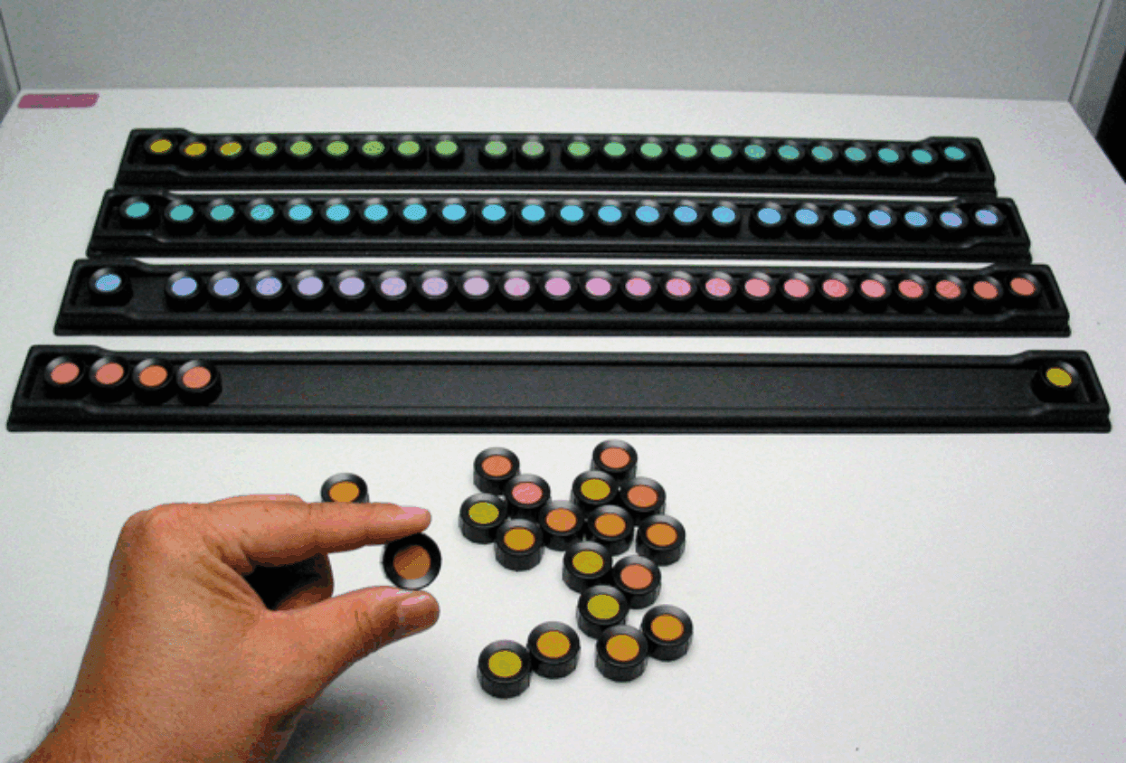
The most common colour vision test is the FM100 test, the Farnsworth-Munsell hue test. Originally the test consisted of a hundred different colour samples which the tested person had to arrange in colour sequence. Later it was found that stable results could be achieved with only 85 tiles, but the name was kept. The F-M 100 test goes way beyond just testing if you are colour blind. While more men than women are what is called colour blind (poor colour discrimination capacity), most of us, both women and men, have a colour discrimination capacity spread from quite poor, to average, to fairly good. Some of us have problems with greens that are close to each other, other have more problems with reds and orange hues, and others with shades of blue. If you work with colours on a professional level it’s well worth taking the F-M 100 test
Metamerism
OK, so we are happy with our print samples, the colours match fine. But horror of horror when we hang or place our lovely interior decoration where it’s supposed to go the colours seem somehow to be different! You have experienced metamerism. This phenomena happens when the pigments used in dyes or inks reacts differently to the different lights used to view them. Metamerism is fairly well known in the graphics arts industry, and was one of the main reasons why it was decided to use a standardised light in viewing booths when evaluating proofs (samples) and final prints. The ISO 3664 standard specifies viewing conditions for photos and prints, using a standardised daylight called D50 at 5000 K. The unit K stands for Kelvin, and describes how “warm” or “cold” the light appears for the viewer.

Caption: If you work with and assess colours on a professional level, you should take the F-M100 test, to check if your colour discrimination capacity really is flawless.
There are other such standards, for example D65 at 6500 K, a “colder” light than D50, and used in RGB standards like Adobe RGB and sRGB. An important part of the D50 specification is the spectral distribution and brightness of the light source. When prints are measured or viewed in for example an office or shop, the colours may look very different, depending on the spectral distribution of the light. So if you are concerned about how your interior decorations look where they will be seen or sold, that you’ll have to take the trouble to evaluate them there, on site. It’s not only the spectral distribution of the light in the lamps that matters, it’s also important to have the correct brightness. Too low light intensity and we don’t see much of any colour.
There are solutions around the corner to handle situations of different light conditions, to adjust or adapt in the software used for colour management. But until the ICC standard is updated, we need to prepare as best we can and evaluate the prints in the final lighting environment. The adjustments needed are more or less manual tweaks and fine tuning. This is possible to do, but quite time consuming. ICC version 5, also called iccMAX, may simplify those type types of adjustments, but this is still in the future albeit a near future.
Source: The Digital Dots team specialises in consulting and editorial for digital prepress, printing and publishing technologies. This includes research, testing, evaluation and content services for publishers, printers and print buyers. This third Wild Format Series is the latest in a long line of educational projects for graphic arts professionals, including designers and content originators. We also publish https://spindrift.click, a subscriber supported premium content website with readers all over the world and a sharp focus on technology. We work on various ISO committees developing standards for print production and the environment, and we are accredited auditors for ISO 12647-2 and ISO 9001 in the UK and Sweden. You can find out more about us at https://digitaldots.info.
FESPA’s new colour management feature, COLOUR L*A*B* will be introduced for the first time at Global Print Expo 2019 in Munich. It is aimed at helping visitors improve colour management practices in their own print businesses. The feature provides a walk-through showcase of representative technologies from a range of specialist suppliers, live demonstrations, guided tours of the exhibit, and educational presentations from subject matter experts.