Colour management in digital textile printing
At the heart of any print project is the desire to achieve the highest possible image quality, and especially getting the colours right.
One of the most rapidly growing segments of digital printing is printed fabrics. As in every other area of digital printing this means that it won’t only be textile production experts who will provide artwork for and initiate print projects on many types of fabrics.
At the heart of any print project is the desire to achieve the highest possible image quality, and especially getting the colours right. But to get there all the involved parties need to cooperate fully, and each do their part to ensure a successful and pleasing result.
As with any printing technology digital print quality, and the colours that can be achieved, depends on three main factors: the print technology used, the inks and, not least, the substrate used. There are some technical factors to consider when it comes to image quality, and for pixel-based images (photos) the two major concerns are resolution and sharpness.
The images need to be of a high enough resolution for the images to be scaled up. The rule of thumb says you need twice the resolution in terms of pixels per inch (ppi) relative to the screen ruling you will use in print.
In commercial print conventional screens are still common, and a screen ruling of 150 lines per inch (lpi) used to be very common, and while higher screen rulings are more common nowadays, an image resolution of 300 ppi is often stated as the required resolution for images.
But in digital printing many types of screening technologies are used, and the calculation of necessary image resolution is not always as straight forward as it used to be. And if the printed product will be viewed at a distance, you may get away with a lower end resolution of the image, maybe down to around 100 ppi, after scaling. If in doubt, ask the print service provider what image resolution they recommend for the type of print you are planning.
Logos and other vector based artwork can be scaled up and down freely, and aren't restricted to a certain resolution as can be the case with photos. But this means that these types of images and illustrations need to be created using software such as Illustrator or similar, which defines the artwork as spline curves (often called line art or vector graphics).
How many colours do you need?
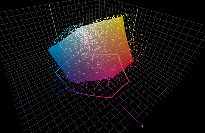
Not all spot colours can be reproduced in the colour space available when using the CMYK process colours. The coloured cubes in the illustration represent single spot colours, while the inner sphere represents the colour gamut of offset print on coated stock. About 40% of the spot colours are found to be out of gamut, non-printable, in CMYK.
All printing devices are limited as to how many colours they can reproduce. So, when you plan your print production you will need to ask yourself what colours are most important in your artwork.
There are two main categories of printing inks used in the industry. For general use the inkset for process colours (Cyan, Magenta, Yellow and Black) is most commonly used to reproduce a reasonably large colour gamut of around 400,000 unique colours. But for brand colours, such as a specific logo colour, ‘spot colours’ are used.
One of the most well-known manufacturers of spot colours is Pantone, which offers over 1000 special hues in the Pantone colour system. If you try and reproduce those special spot colours using CMYK you will find that only about 60% of the spot colours can be accurately colour matched using the CMYK ink set. So, if one or several spot colours are critical for your print, you will need to pay extra for the printer to use these special inks.
The problem is that few digital printing systems, if any, can load all the Pantone spot colour inks in the press. For this reason more and more printing systems have started to use what is called an extended colour gamut, which means that the traditional CMYK base colours are complemented with Orange, Green and Violet.
Using an extended colour gamut ink in the printing press, around 90% of the Pantone spot colours can be reproduced faithfully, depending on what substrates are used. If you have used the Pantone colour guides you will have noticed that they come in at least two base versions. One guide is printed on glossy paper, and will show the most saturated and rich colours.
Another colour sampler is printed on uncoated paper, and the same colours will now look less saturated. This is just how it is, a physical phenomenon, and every type of printing substrate has its limitation in terms of what colour gamut it can reproduce, given a specific inkset.
So, if certain colours in your design are crucial for you, make sure the printer can reproduce them in a colour accurate way, and ask for printed, colour-accurate proofs beforehand, so you are not disappointed when you receive the final prints.
Hard or soft proofs?
The beauty of using a digital printer for print production is that you can then normally use that printer as the proofing device. It should be possible to print an example of your artwork in the very same printer that will be used for the final print run. But there is a way to simulate the printed result on other digital devices, including a monitor. This is by using the ICC profile created to calibrate and characterise the digital press.
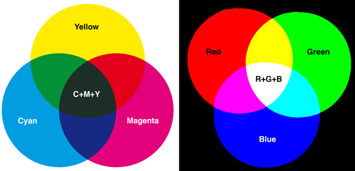
In applied colour management we handle both the Subtractive (left) and Additive (right) colour systems, as well as the special colours available when using spot colour ink setups.
This technology has been around for many years now. The International Color Consortium which introduced the technology was founded in 1993. But for some reason this colour management technology is not entirely understood or used in all parts of the graphic arts industry.
Correctly implemented it means that every device that is used to create, modify or reproduce colours can be calibrated and characterised using ICC technology. At the core of this is the ICC profile, the data file which describes what colour gamut the device is capable of reproducing.
So, if you save your images (photos) in Adobe RGB, for example, you work in a colour gamut of around 1.2 million colours. If you save them as sRGB (very common in consumer cameras and images prepared for web publishing), instead, you work in a smaller colour gamut of around 800,000 colours. Every printing press has limitations for how big a colour gamut it can reproduce, meaning how many unique colours there are in its colour space.
A common reference colour gamut is the offset gamut of colours printed on good quality coated stock, using standard CMYK process inks. This colour gamut covers about 400,000 colours. It may sound like this is far from sRGB or Adobe RGB but, since the primary colours for a monitor are RGB, while in print the primary colours are CMYK, the visual result is not so different because those two colour systems work in a completely different way from each other.
The monitor (and camera) colour system use an additive colour system, since different wavelengths of light are added to produce the colour by emitting light directly into the eyes. When all wavelengths are present at full strength, we perceive this as being white. In print however the CMYK colour system is based on a subtractive process, where light is projected to the surface, and then reflected through a thin layer of ink film.
When we add colours to the printed surface the reflected light will give the appearance of different colours depending on the mix. If all colours are present we get black (or almost black, because of impurities in the CMY pigments). So, we add a pure black ink and call it K because it is the “Key colour”. It is also practical when printing black text.
There are some colours in the CMYK subtractive system which are not present in either sRGB or Adobe RGB, especially the saturated Yellows and Cyan. Visually however, the Adobe RGB colour gamut matches the gamut of high quality offset quite well, and this is in part why the offset gamut is used as a reference colour gamut when using many other printing processes.
When you set up a proofing device, and this could be your own colour printer, you need first to calibrate it to a set status, for a certain type of paper. You will need a spectrophotometer to do this, but there are quite affordable solutions on the market, for example the X-Rite ColorMunki.
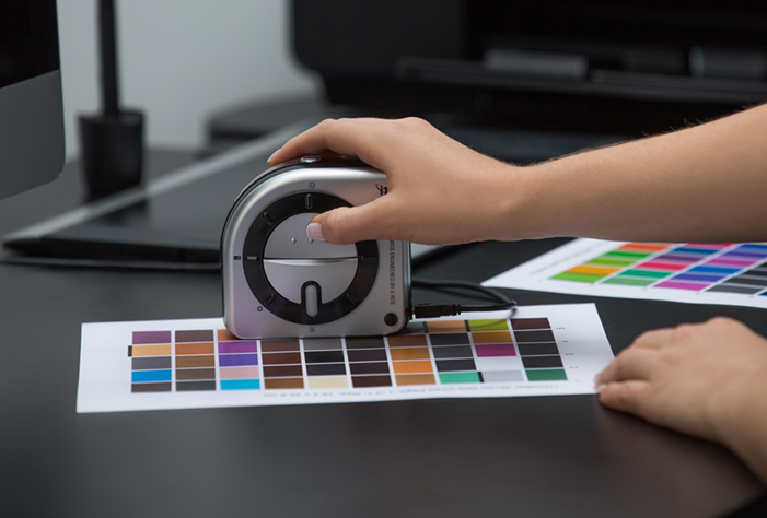
In order to colour manage print you need a spectrophotometer. One of the most affordable is the X-Rite ColorMunki, shown here. The ColorMunki can also be used to calibrate a monitor.
The ColorMunki can by the way also be used to calibrate your monitor, so you’ll get a long way using it. After you have calibrated your device you print (or on a monitor project) several colours and measure them with your spectrophotometer. Those measurements are then used to create the ICC profile for the device.
When you apply colour management you use the necessary ICC profiles to either convert colours between colour spaces, or simulate colours on one device using the ICC profile for another device. Once you have understood how this works you can manage all colours in your printing project, and have serious discussions with your print service provider if you think that they should be able to manage the colours better.
If you use the Adobe Creative Cloud or similar when creating your artwork, you can set the colour settings to use the correct ICC profiles to either make hard-copy proofs on your calibrated printer, or do what is called softproofing on your monitor.
From now on there shouldn’t be any nasty surprises when you get the final prints because you have checked that the colours are what they should be early on in the process using hard or soft proofs.
About the author
Paul entered the graphic arts industry in 1980, first as a typographer and graphic designer, later as production manager. He act as Senior Technical Editor at Digital Dots and is one of the founders.
In parallel he lectures part time for the Graphic Arts Departments at Malmö and Copenhagen Universities. Since 2008 Paul is an UKAS accredited auditor for ISO 9001 and ISO 12647 certification. He is also an appointed expert to ISO TC130, the international technical committee responsible for authoring ISO standards for print media production.
The Wild Format guides are intended to expand awareness and understanding of the craziness that can be created on wide format digital printing devices, from floors to lampshades and everything in between.
These guides are made possible by a group of manufacturers working together with Digital Dots.This article is supported by EFI, Fujifilm, HP and Digital Dots.
Topics
Interested in joining our community?
Enquire today about joining your local FESPA Association or FESPA Direct
Recent news

Screen Printing
The power of digital design tools in screen printing
James Gatica shares how the combination of traditional screen-printing techniques with cutting-edge digital design tools is revolutionising the way designers conceptualise and produce custom decorative pieces.
25-04-2024

Personalisation
Key trends and market shifts on Personalisation and Sportswear with Epson
Debbie McKeegan speaks to Duncan Ferguson, VP of Commercial and Industrial Printing at Epson Europe about the market shifts and current trends around personalisation. Duncan shares the key trend of merging both fashion and sportswear.
25-04-2024

